Primary logo, black
For white, cream and light backgrounds. Use this version by default.

Brand guidelines
Our logo, colours, typefaces and voice: everything you need to present Ruth Prowse School of Art clearly and consistently.
Logo
Our logo is a hand-drawn pencil above the school's name, set in widely spaced capitals. Use the full logo wherever there is room. The pencil mark on its own is a signature for small spaces, once the name already appears nearby. Every file is supplied in black and white only.
For white, cream and light backgrounds. Use this version by default.
For dark colours and photographs with a calm, dark area.

A signature for small spaces once the full name is already visible.

The pencil mark for dark backgrounds.
Square 1024 px PNGs with safe margins, ready for round social media crops.
Every logo above in SVG and PNG, with a short usage note. 406 KB.
Download ZIPUsing the logo
x
x
Keep a margin of at least x on every side, where x is the height of the letters in RUTH PROWSE. Nothing else (text, edges, other logos) goes inside it.
120 px · 30 mm
48 px · 12 mm
Below these widths the fine pencil lines and "SCHOOL OF ART" stop reading clearly. Go bigger whenever you can.
Black on cream, white, sage and gold. White on navy, ink, teal and dark, calm areas of photographs.
Stretch or squash it
Rotate or tilt it
Change its colours
Add shadows, outlines or effects
Ruth Prowse
Retype or rearrange it
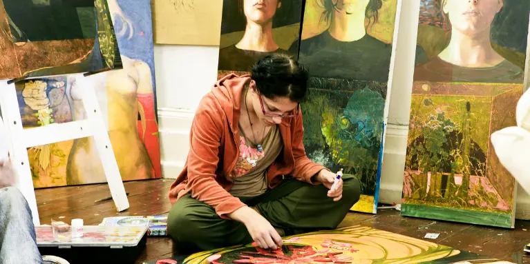
Place it on a busy background
Colour
Deep navy and ink carry the words. Sage, teal and cream keep things calm, and gold, coral and sage mark out the three diplomas. Use the accents in small, confident doses. Select a colour code to copy it.
Headings, the footer and deep backgrounds.
Links, buttons and form fields.
The footer and calm supporting panels.
The page background: warm paper, never stark white.
Calls to action and highlights. Jewellery Design.
Fine Art.
Graphic Design and the solid header.
Paragraphs and long-form reading.
Dividers and borders.
Cards and forms on cream.
Typography
The logo itself is artwork, so never try to retype it. For everything else, use these free fonts. They are all available from Google Fonts.
Talent decides who belongs here.
Aa Bb Cc Dd Ee Ff Gg 0123456789
A sturdy slab serif with a hand-made warmth. Semibold for headings. Get the font
Small studios, practising artists as lecturers and three accredited diplomas.
Aa Bb Cc Dd Ee Ff Gg 0123456789
Clear at every size. Regular for reading, medium for buttons and labels. Get the font
Portfolio-based admission since 1970.
Aa Bb Cc Dd Ee Ff Gg 0123456789
Geometric and open. Use it sparingly for short statements and labels. Get the font
1970 · 2027
Aa Bb Cc Dd Ee Ff Gg 0123456789
Very large years and numbers only, in deep gold. Tinos is the free equivalent. Get the font
Graphic elements
Fine Art
Coral square
Graphic Design
Sage triangle
Jewellery Design
Gold pentagon
Each diploma has its own shape and colour. Use them as quiet markers on banners, cards and printed matter, a few at a time, floating or slightly rotated. They are never a replacement for the logo.
A soft "///" hatch tucked into the edge of cards, like a pencil test on the corner of a page.
Four dots that lead the eye forward on buttons and calls to action.
Voice
RPSA opened in 1970 as an act of creative defiance, and it still talks like a studio rather than an institution: direct, warm and encouraging. Our line is Create anyway.
Say what we believe plainly. Let facts carry the confidence, not superlatives.
Every mentor knows every student by name. Write to one person: "you", not "applicants".
Fees, dates, requirements and next steps in plain language, in short sentences.
Talent and willingness decide who belongs. Never assume a background, an age or prior training.
Boilerplate
For press releases, programmes, partner websites and grant applications.
Ruth Prowse School of Art is a non-profit art school in Woodstock, Cape Town, founded in 1970 by artist Erik Laubscher.
Ruth Prowse School of Art is a non-profit art school in Woodstock, Cape Town, founded in 1970. It offers three-year, NQF Level 6 accredited diplomas in Fine Art, Graphic Design and Jewellery Design, plus short and part-time art courses, taught by practising artists and designers.
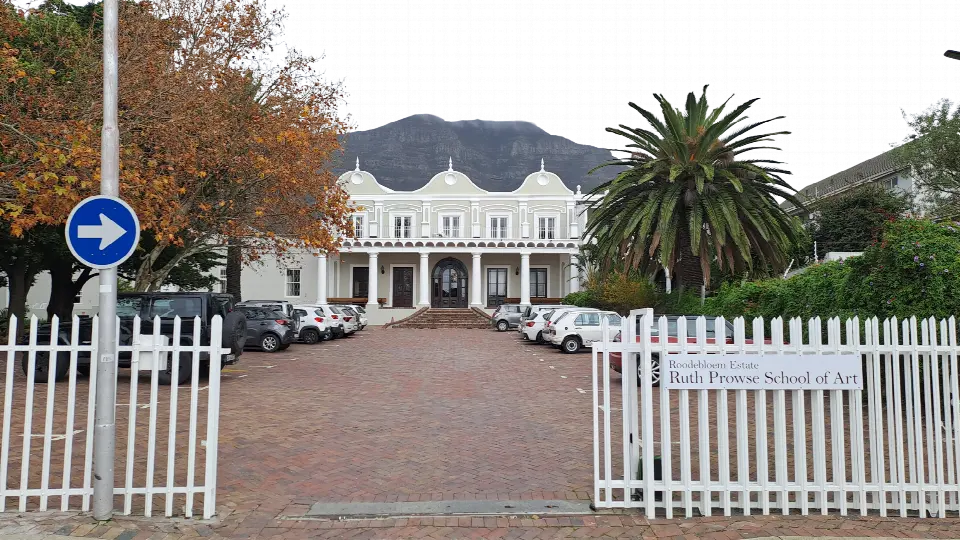
Ruth Prowse School of Art (RPSA) was founded in 1970 by artist Erik Laubscher and welcomed its first students in 1971, as one of the only non-discriminatory art schools in South Africa at the time. Today the non-profit school offers three-year, NQF Level 6 accredited diplomas in Fine Art, Graphic Design and Jewellery Design, plus short and part-time courses. Studios are small, every lecturer is a practising artist or designer, and admission is based on portfolio and potential. The school is on the Roodebloem Estate in Woodstock, Cape Town, a declared National Monument.
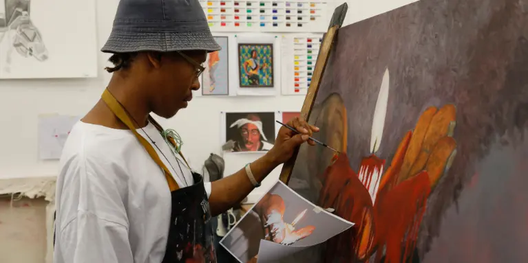
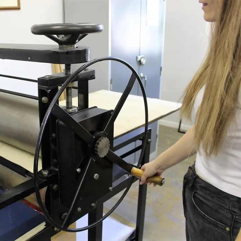
Photography
Press, partners and permissions
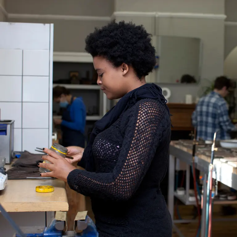
High-resolution photographs, interviews, or permission to reproduce student and graduate work: get in touch. Artworks remain the copyright of the artists who made them.